Book a Free Consultation
Central banks are facing higher rates of inflation, well above the 2% target. In order to combat inflation, a central bank has to embark on a path of restrictive monetary policy which means to raise nominal interest rates. Today, there is much uncertainty about interest rate policy, especially about the amount of basis points interest rates have to go up and about the number of interest rate hikes. Naturally, this adds uncertainty to the markets due to a lower degree of predictability with respect to interest rate hikes i.e. how many interest rate hikes and which amount per hike should be priced in? In this respect, markets are assumed to price in or to include all relevant information from the recent past up to the present into the prices of assets and market participant are assumed to have rational expectations which means that given the set of available information they try to forecast future price movements. Market reactions can be volatile, especially when there are unforeseeable news or surprises i.e. information that has not been priced in.
Market participants know that interest rates will go up, but not by how much or how often which means that there is some room for surprises which could add to stock market volatility.
Nevertheless, there is consensus among central bankers that an abrupt tightening can be very harmful to the economy in terms of higher unemployment, lower GDP growth and lower stock market valuations. Therefore, a gradual approach is needed.
Basically, the Fed tries to avoid very abrupt rate hikes. Nevertheless, the question remains how often will the Fed raise interest rates? Nasdaq.com (“Interest Rate Hikes 2022: How many the pros are predicting for this year”) gives some clues: Goldman Sachs expects 5 rate hikes in March, May, July, September and December. Bank of America expects 7 hikes and also cut its GDP growth from 4% to 3.6%.
In general, rising interest rates have adverse effects on the economy, especially on GDP growth via private consumption and real investments, leading to higher unemployment and they usually lead to stock market corrections.
Rising rates affect private consumption through higher borrowing costs and higher savings rates. Higher interest rates may incentivize people to save more money, which is a good thing, but it will result in less spending, which can be a drag on the economy. As yields rise further, risk-averse investors may switch from stocks to the safe haven of Treasury and investment-grade corporate bonds, which can also result in lower stock prices.
Rising rates also affect real investments via higher borrowing costs: When interest rates increase, their borrowing costs will increase, which means less cash available to pay workers or grow their markets.
This section considers some broad aspects of Technical Analysis like Relative Strength Analysis between Consumer Discretionary and Consumer Staples, the McClellan Oscillator for measuring market breadth, the Correlation between the 10-year US Treasury Yield and the Nasdaq Composite Index, an Analysis of the 11 stock market sectors as well as some applications of simple moving averages (SMAs) and the Ichimoku Cloud to the Nasdaq as well as to the 11 market sectors.
Chart 1 shows the Relative Strength Ratio between the Consumer Discretionary and Consumer Staples in the top panel, the Nasdaq Composite Index in the main panel, the 50-period Correlation between the Nasdaq and the 10-year US Treasury Yields (first bottom panel) and the 10-year US Treasury Yield (second bottom panel).
One of my favorite approaches of assessing the strength of the market is watching the Ratio between Consumer Discretionary and Consumer Staples. Ratio means that one time series is divided by the other one. A rising ratio means that Consumer Discretionary are outperforming Consumer Staples which makes sense during a bull phase. The reverse holds true during a bear phase when consumers are ditching discretionary goods in favor of staples. Some examples of Discretionary are Automobiles, Clothing and Accessories, Hotels, Recreational Products, Toys or Durable Household Products whereas Consumer Staples consist of Food Retailers and Wholesalers, Food Products, Soft Drinks or Nondurable Household Products.
The main panel depicts the Nasdaq Composite Index using Candlestick Charting, the 50-day Simple Moving Average, the 200-day Simple Moving Average and the Ichimoku Cloud as well as trading volume.
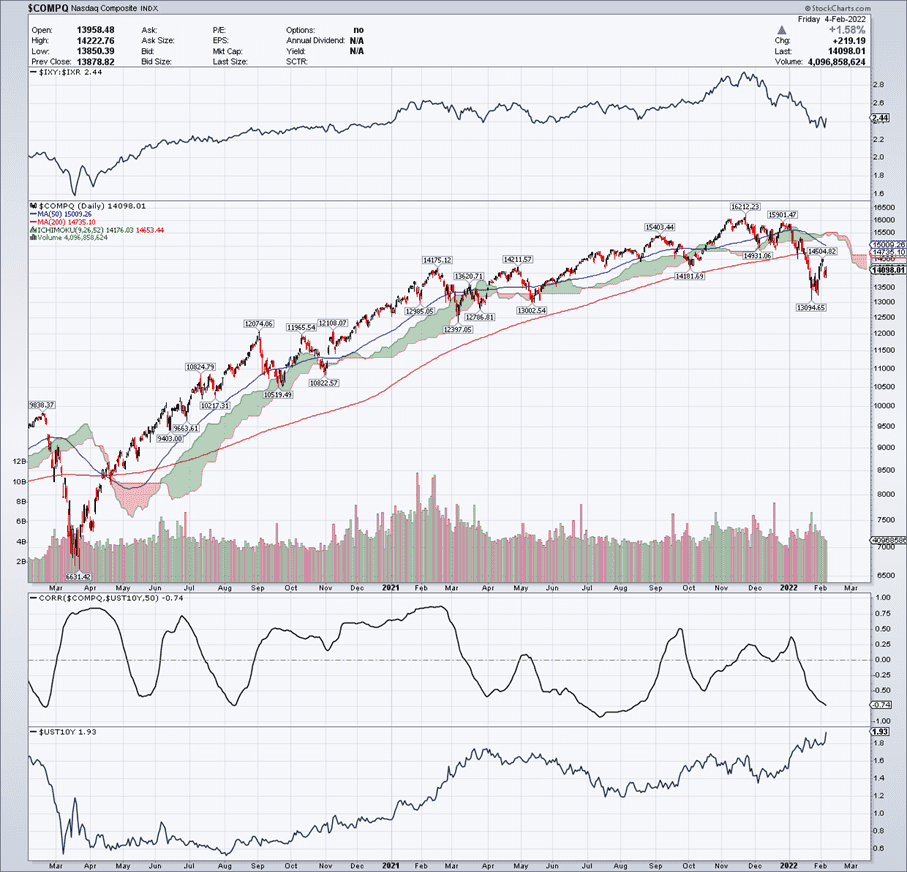
What does this chart reveal? Considering the top panel, Consumer Discretionary outperformed Consumer Staples most of the time. During this time, the Nasdaq had a bull run. This outperformance came to an end in December 2021 when it actually reversed. From this point onwards, the Nasdaq started to weaken until it got bearish (which is characterised by trading below the Ichimoku Cloud). At the moment, the SMA(50) has a negative slope, approaching the SMA(200). A crossing of both lines is labelled as a “death cross” which is a well known technical bearish signal. The odds for this are quite high.
The lower panels depict a 50 period Correlation coefficient between the Nasdaq and the
10-year US Treasury Yields as well as the 10-year US Treasury Yield closing at 1.93% on February 4th. The Correlation coefficient is negative at -0.74. This tells us that rising yields lead the Nasdaq lower. Yields have been stable and low for a long time (from April 2020 until February 2021 or so) when they started to rise. An initially positive correlation turned into a negative one which shows the depressing effect of rising yields on technology stocks.
A Moving Average has a certain length which for the scope of this study was chosen to be 50 and 200 periods. The length refers to the size of the moving window which actually defines the value of the moving average. I have chosen a simple moving average which equally weighs every data point (in contrast to an exponentially weighted moving average which weights recent data points more than older data points). The most interesting technical indicator is the Ichimoku Cloud or by its full name Ichimoku Kinko Hyo which translates into “one look equilibrium chart”. The Ichimoku Cloud calculation is based on moving averages. The cloud is formed of Leading Span A (which is based on short-term moving averages) and Leading Span B (which is based on long-term moving averages). The cloud is green when Leading Span A is above Leading Span B and red when the reverse holds true. Prices above the cloud are bullish – the bullish trend is reinforced by a green cloud. Prices below the cloud are bearish – the bearish trend is reinforced by the red cloud. The cloud is shifted forward 26 days, so it provides a glimpse of future support and resistance. I have added the Ichimoku cloud because it is more compact than the SMA(50) and SMA(200). The SMA(50) and SMA(200) are primarily used for visualizing the “golden cross” and the “death cross” which are important technical market signals being followed by many market participants. On the other hand, the cloud is one indicator. During a bull run, it can be used to “buy the dips” which means to accumulate positions at the lows of a trend. A low is characterized by net demand i.e. at this point demand is higher than supply so prices are rising shortly after. It can be seen that the Nasdaq found support in the neighbourhood of Leading Span B several times during its bull run. In addition to this, it is quite simple to check whether prices are above the cloud (bullish) or below the cloud (bearish). Seen this way, the Ichimoku Cloud is the principal demarcation line between bullish and bearish. For the rest of this study, the Ichimoku Cloud will be used primarily for this scope.
Chart 2 depicts the Nasdaq Index over a 1-year period, the McClellan Summation Index as well the McClellan Histogram. The McClellan Oscillator (here shown as a histogram) is a breadth indicator derived from Net Advances, which is the number of advancing issues less the number of declining issues. Subtracting the 39-period exponential moving average of Net Advances from the 19-period exponential moving average of Net Advances forms the oscillator. StockCharts.com calculates this indicator as ratio adjusted which means that instead of using Net Advances (in absolute terms), it calculates Net Advances as a percentage of advance plus declines. The result is then multiplied by 1000 to obtain whole numbers and eliminate decimals. As can be seen, the McClellan Histogram shows many periods when declining issues dominated although the Nasdaq was rising. This shows that the uptrend was supported by fewer and fewer advancing issues (mainly large-cap stocks). This is an example of weak market breath.
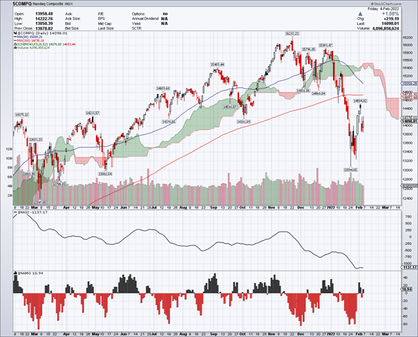
The first bottom panel shows the McCellan Summation Index which is a line and is based on the McClellan Histogram/Oscillator. The Summation Index rises when the McClellan Oscillator is positive and falls when the McClellan Oscillator is negative. Extended positive numbers in the McClellan Oscillator cause the Summation Index to trend higher. Conversely, extended negative readings cause the Summation Index to trend lower. Because of its cumulative nature, the Summation Index is a slower version of the McClellan Oscillator. The index crosses the zero-line fewer times and produces fewer signals in general. Whereas the McClellan Oscillator can be used for short-term and medium-term timing, the Summation Index is generally used for medium-term and long-term timing. Here, the McClellan Summation Index has a reading of -1137.17 which signals a bearish trend in the Nasdaq.
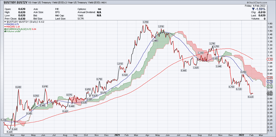
Chart 3 depicts the yield curve as the difference between the 10-year US Treasury yield and the 2-year US Treasury yield.
In general, the yield curve reflects the way investors think about risk. In a normal situation, one would expect to receive a higher compensation (yield) for longer maturities. When you lend money to the government for 20 or 30 years, it makes sense to receive a higher compensation than when you lend it for only a few months or a year. This means that bond yields implicitly have a risk premium, the higher the yield, the higher the risk and vice versa.
Essentially, there are three possible shapes that we can see in the yield curve. A Normal curve has short-term rates lower than long-term rates; an Inverted curve has short-term rates that are higher than long-term ones; and a Flat curve has short- and long-term rates that are roughly the same.
Using the Ichimoku cloud as principal demarcation line between bullish and bearish, the Yield curve changed direction in June 2021. This means that before this date it had a positive slope whereas after this date its slope turned negative. This means that investors expect a higher amount of risk in the near future (or in the short-term). The actual shape of the Yield curve is bearish for the markets.
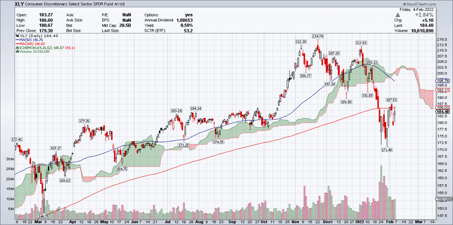
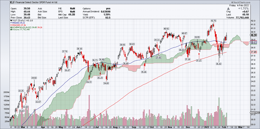
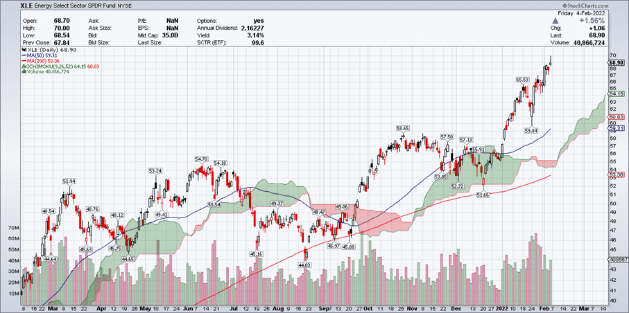
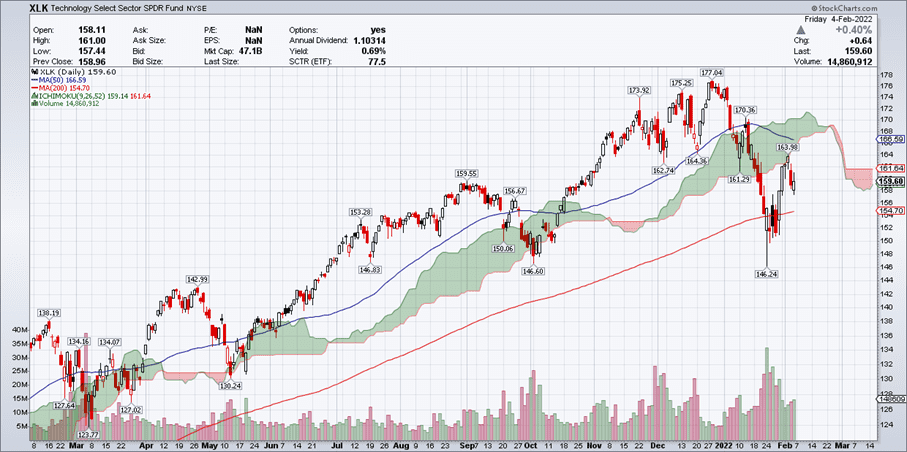
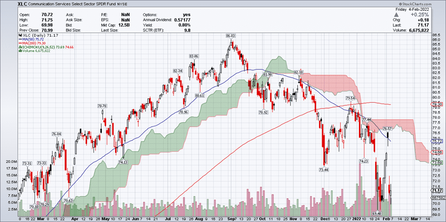
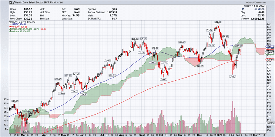
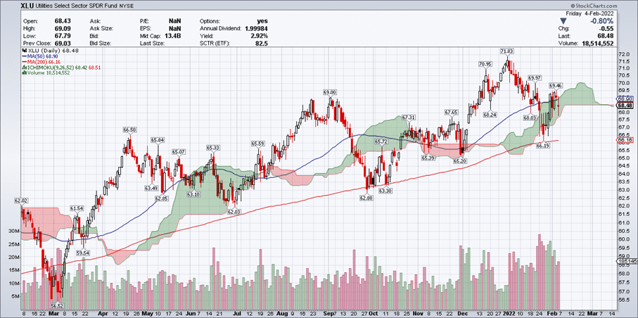
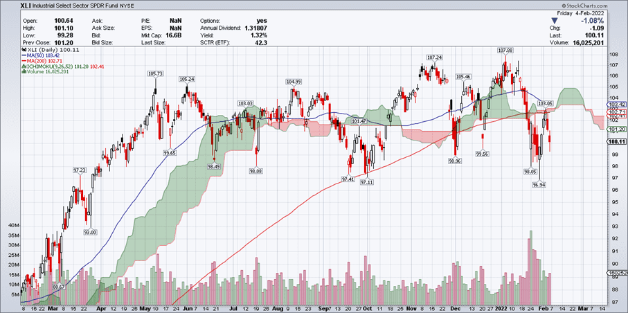
According to the Global Industry Classification Standard (GICS), the US stock market is composed of eleven industry sectors. This is done because it is easy to compare companies that have similar business models.
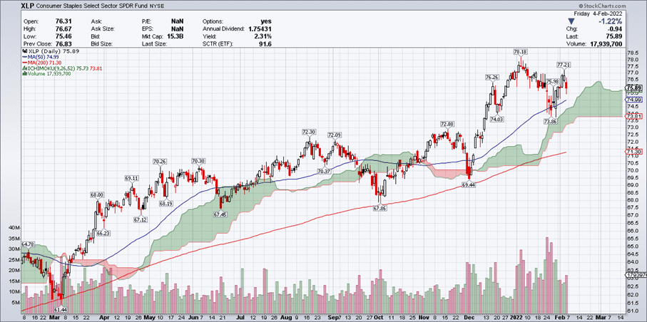
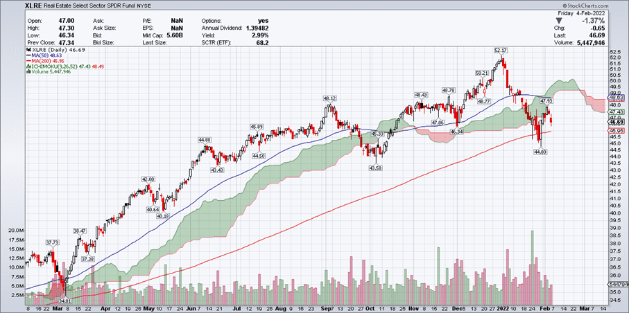
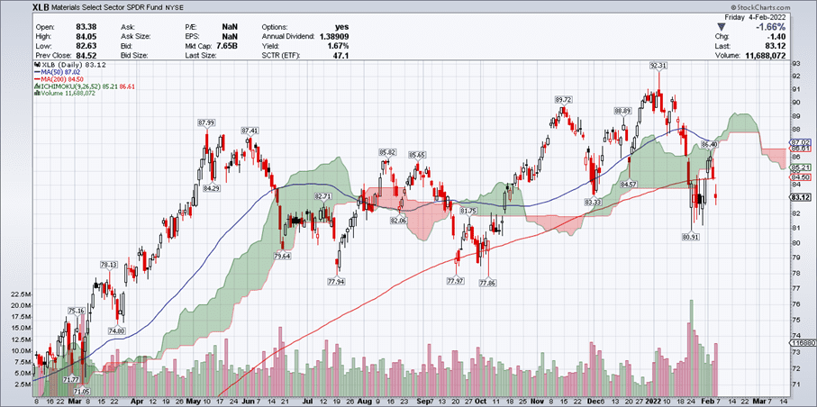
This section provides a broad analysis of these industry sectors by means of the Ichimoku cloud. If an industry sector is trading above the cloud it is considered bullish whereas if it is trading below the cloud it is considered bearish.