
Technical analysis is mainly about working out how a market is likely to move. You’re looking at price action, trends, support and resistance, and momentum to sketch out probable paths, important levels, and potential turning points. Macroeconomics, by contrast, helps you understand why the market is moving in a certain direction. Growth, inflation, employment, monetary and fiscal policy, and overall risk sentiment. Put simply, technicals show you the market’s behaviour and structure, while macro gives you the story behind it. When you combine the two, you get both a roadmap (how) and a narrative (why) for price action.
A lot of retail traders are actually more often right on direction than they realise. Their big picture idea for example, “this currency should weaken if the central bank turns dovish” is often perfectly sensible. Where it falls apart is timing. Entries come too early, before the market has finished pricing the old story, or too late, when most of the move has already happened. Without using technicals to wait for confirmation or respecting key levels around major data releases, traders end up sitting through deep drawdowns, getting stopped out at the worst point, or chasing tired moves. The idea is fine; it’s the lack of alignment between technical structure and the economic calendar that turns a good idea into a bad trade.
Let’s start with the macro. The starting point for a solid macro view is having a clear, informed sense of what the central bank is likely to do next with interest rates. That doesn’t come from headlines or gut feel; it comes from the high impact data on the economic calendar. Data such as inflation prints, labour market reports, growth numbers, and key surveys. By tracking how these releases fit with the bank’s mandate and recent communication, you can build a realistic view of whether policy is more likely to tighten, ease, or stay on hold. That expected rate path then becomes the backbone of your broader macro narrative and, ultimately, your trading strategy.
To make this more concrete, let’s walk through a trade the team took on 22 October 2025, against the backdrop of a softening UK economy.
The macro data were pointing to a broad-based slowdown:
- GDP (YoY): growth slipped from 1.7% to 1.4%
- Manufacturing PMI: 49.6, back below the key 50 expansion/contraction line
- Services PMI: still expanding at 51.1, but well off the peak of 54.2
- Unemployment: up from 4.8% to 5.0%
- Consumer Confidence: -17, the weakest in the G8
- Business Confidence: -27, also the weakest in the G8
- CPI (YoY): stuck at 3.8% for two months in a row
Taken together, that’s an economy clearly losing momentum, while inflation sits stubbornly above the Bank of England’s 2% target. In an ideal world, the BoE would like the flexibility to cut rates to support growth, but with inflation still elevated, the risk of stagflation is hard to ignore. Before the Bank can credibly move toward easing, it would need to see clearer signs of disinflation or at least a convincing pause in the upward pressure on prices.
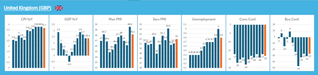
Figure 1 – Current UK Macro Economic Data
Going into the inflation release on 22 October, sterling was actually holding up reasonably well. It had been trading higher against most major crosses, with one key exception: GBPUSD.
- GBPAUD: +1.30%
- GBPNZD: +0.50%
- GBPCAD: +0.06%
- GBPJPY: +2.14%
- EURGBP: -0.46%
- GBPUSD: -0.59%
Given the softness running through the UK data, this resilience in sterling looked vulnerable. If the upcoming inflation figure came in lower, it would effectively open the door for the BoE to think about rate cuts. That, in turn, would likely force the market to reprice sterling lower.
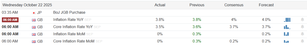
Figure 2 – UK Inflation (October 22nd release)
At the release, the two key numbers of Inflation YoY and Core Inflation YoY either held steady or ticked lower. That was exactly the kind of catalyst we were looking for. It brought both smaller retail traders and larger institutional players into the same trade idea at the same moment.
At that point, the framework was complete:
- A clear macro view (weakening growth, still elevated but softening inflation)
- A central catalyst to lock in timing (the inflation print)
What remained was the technical side: mapping out how price could realistically move from point A to point B, while keeping risk tight and psychology under control.
Profiling formed the foundations of the technical view. Volume is simply a measure of how much is being traded at a given time, how many contracts, shares, or lots change hands. It tells you how much participation there is behind a move.
Market Profile on the other hand is a way of visualising where the market has spent most of its time and done most of its business at different prices. Instead of focusing on time (candles), it focuses on price distribution: which prices attracted the most trading (value areas), where the market rejected price quickly (single prints), and where key reference points like the Point of Control (POC) sit. In practice, traders use market profile to identify value, imbalance, and likely areas of support/resistance based on previous auction behaviour.
Technical Confirmation:
- Market Profile Excess
In Market Profile terms, bearish excess is a sign of emotional, one-way selling at the top of a move. On the profile, it looks like a thin, stretched-out tail at the top (often just a few single prints) where price was quickly rejected and sellers smashed bids with almost no two-way trade.
- The market pushed higher.
- Sellers hit it hard and fast.
- Price never really “settled” up there.
That kind of excess often marks a potential swing high.

Figure 3 – Market Profile Excess
- Market Profile Poor Lows
Poor lows are lows that look “unfinished” from an auction point of view. They tend to show:
- A very flat, shared low across multiple TPOs or candles.
- No real tail or spike lower that would indicate aggressive buying stepped in.
So, the market stopped falling not because buyers strongly rejected lower prices, but more because it simply ran out of sellers at that moment. These lows are considered vulnerable and are often revisited.
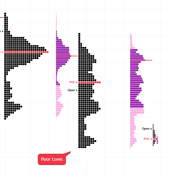
Figure 4 – Market Profile Poor Lows
- Volume Profile Vale Area Position
When the value area keeps shifting lower over time, it means most of the trading (typically about 70% of volume or TPOs) is happening at lower prices. That tells you:
- The market is accepting lower prices as fair value

Figure 5 – Volume Profile Value Area
- Opening price versus Value Area
When the market opens below the prior session’s value area, it starts the day out of balance to the downside.
- Price is opening below where most of yesterday’s trading took place.
- There’s early downside pressure or bearish sentiment, especially if buyers don’t step in quickly.
- If price fails to get back into the previous value area, you can often see a trend day lower.

Figure 6 – Open versus Volume Profile Vale Area
- Market Profile Cave (Single Prints)
- A cave fill in Market Profile is when price moves back through a low volume pocket.
- A cave fill is when price comes back later and trades through that hollow zone, filling it in with more volume/TPOs.
- Once the cave is filled and more trading has occurred, that zone can evolve into a new area of value and may act as future support or resistance.
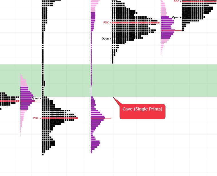
Figure 7 – Market Profile Cave
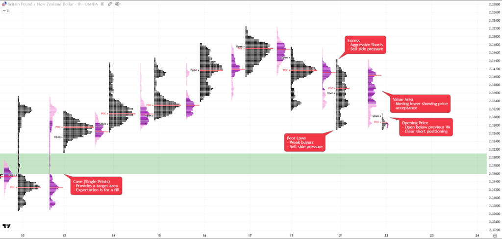
Figure 8 – GBPNZD Full technical profiling overview
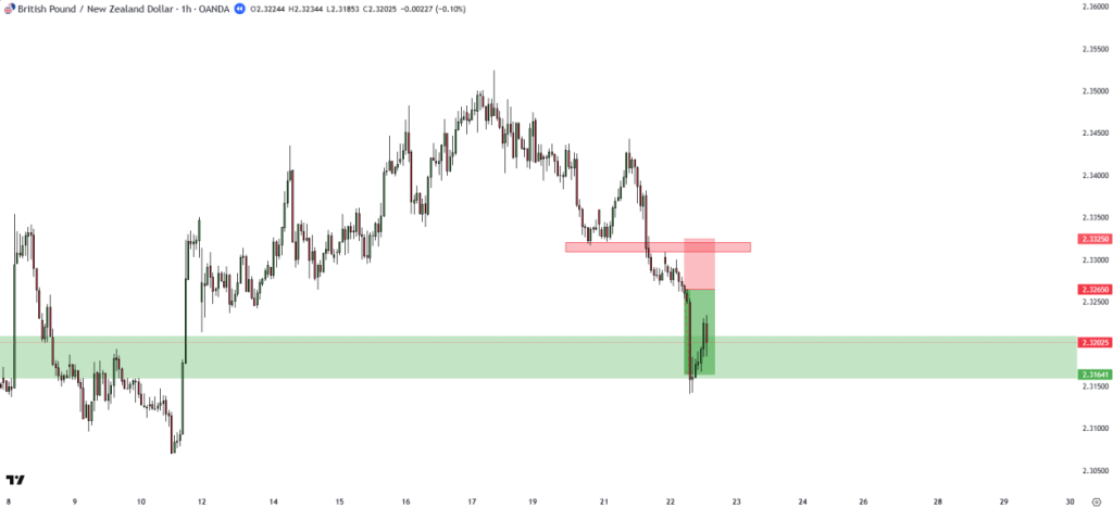
Figure 9 – GBPNZD trade Entry, Stop Loss and Target
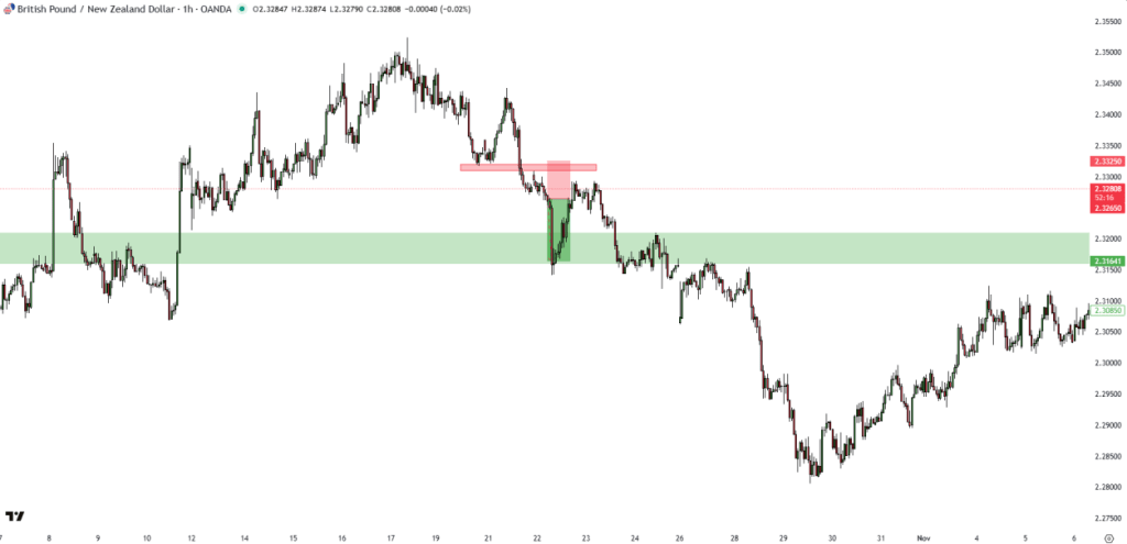
Figure 10 – GBPNZD outcome post data release
This release ended up setting the tone not just for the intraday move and initial reaction, but also for a longer term swing. GBPNZD went on to fall 1.95% from the announcement to the subsequent low.
This case study is a neat example of how a clear macro view, combined with the economic calendar and a structured technical process, can turn a good idea into a high conviction trade. The UK data framed a slowdown with sticky inflation and a tricky backdrop for the BoE, raising the risk of a bearish repricing in sterling if inflation softened. The inflation release on 22 October gave us the timing trigger. Then the technicals of volume and Market Profile mapped out a clean path lower and confirmed acceptance of cheaper prices. The result wasn’t just a quick scalp, but a sustained swing, showing how the why, when, and how of a trade can line up in a single, coherent process.